Narrowing Lexis’s Display of Cases
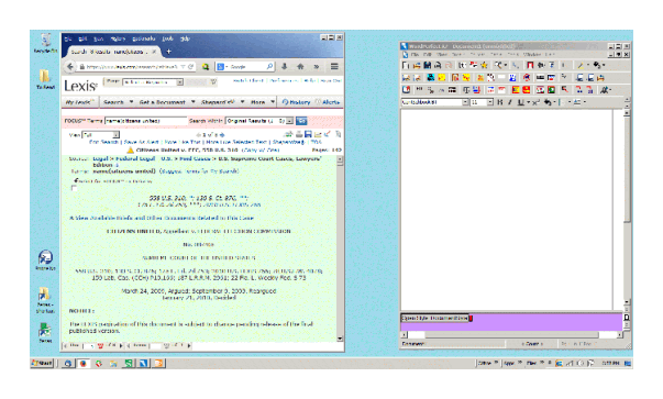
When I write briefs, I like to have a lot of programs open at standard places on my desktop screen: My WordPerfect word processor, my personal research notes program, a PDF viewer, a Freeplane mindmap, and my Lexis legal research, which I view through Firefox. By clicking the correct part of the screen, I can always pull up the desired program.
A problem arose when Lexis redesigned its case display page to add various links in a panel on the left side of the display. Turning that display off by pressing the “<<” button should work, but unfortunately, the display of the lower navigation bar and of the case itself does not always work as expected. After giving up trying to fix that, I decided to work on altering the CSS scripts that control the display coming from Lexis in order to get it the way I wanted, primarily by getting rid of the elements that require excessive horizontal space. Here is the standard display of Lexis and WordPerfect. Keeping Lexis’s horizontal elements required that it overlap WordPerfect.
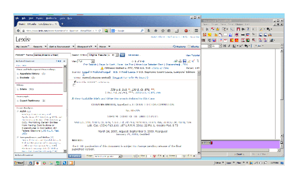
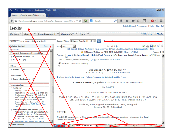
So I decided to use the Stylish CSS editor to revise the Lexis display, by removing the “Additional Content” panel on the left and certain items above and below the case display, followed by moving other elements on the navigation bar to open space, as shown in the next diagram.
Using Stylish, I created a script that does this to my satisfaction. The script can be found here: https://userstyles.org/styles/105493/lexis-narrow. It changes the Lexis display to look like this:
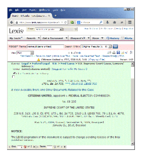
Now, Lexis and WordPerfect sit comfortably side-by-side on my desktop.